IDEAL Workplace Solutions

An Ideal Match for Workplace Innovation
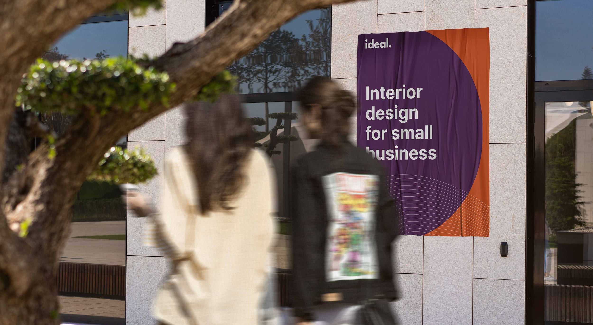
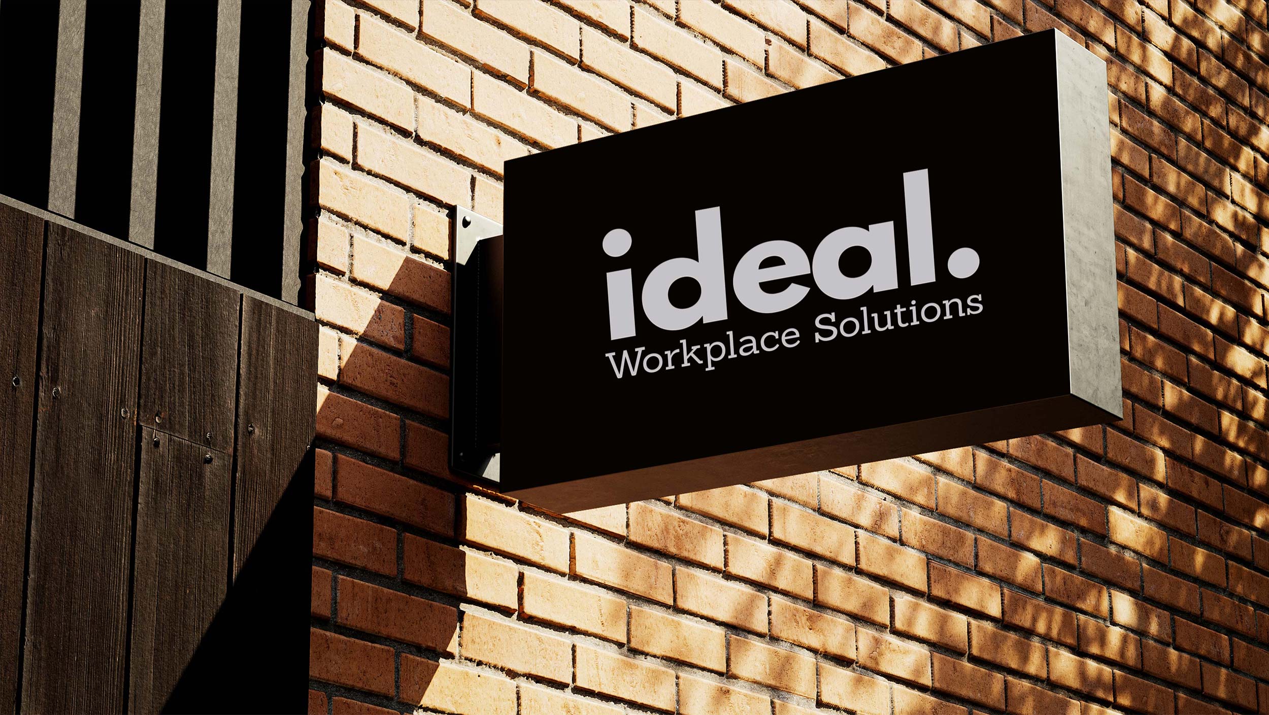
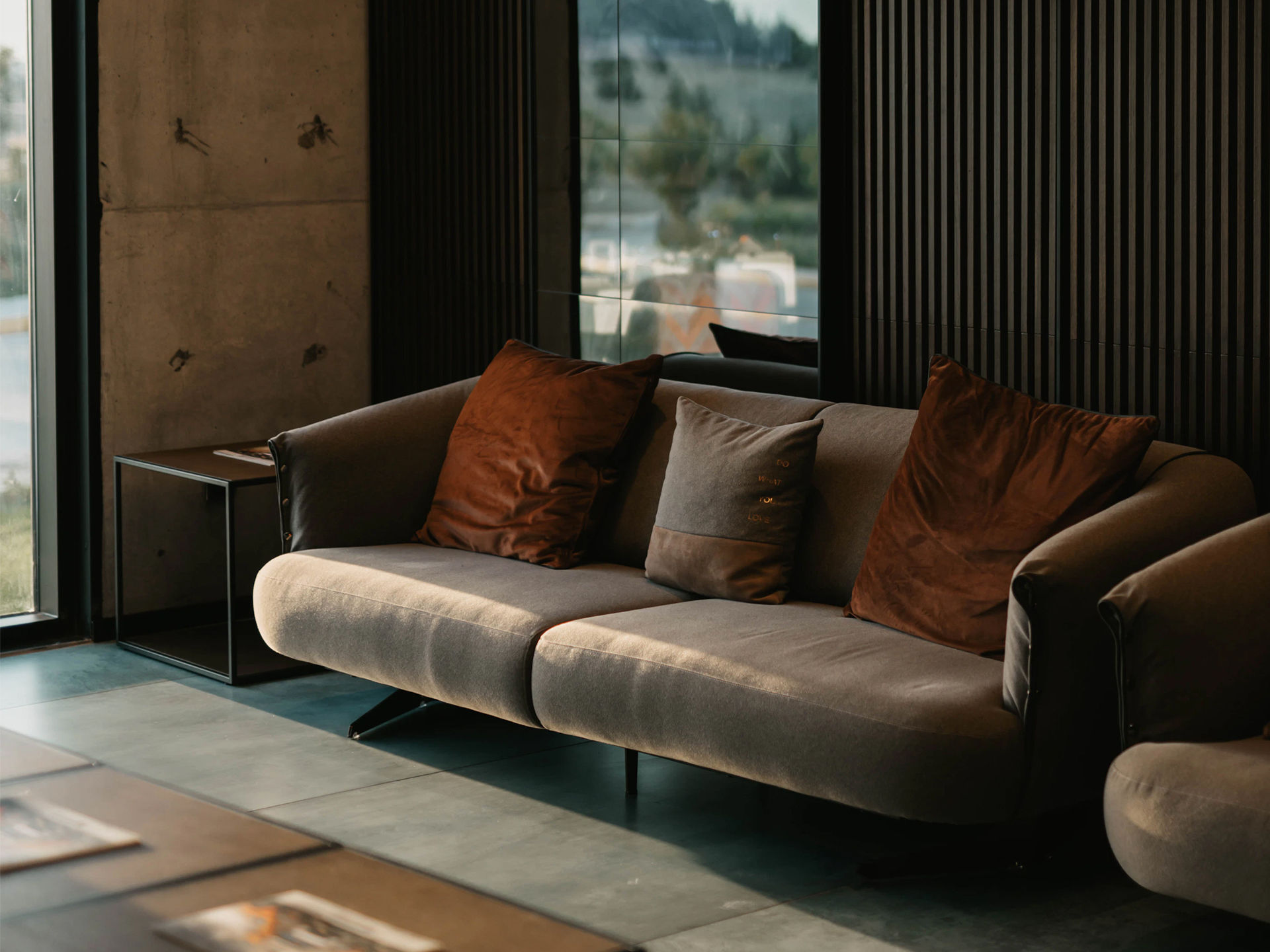
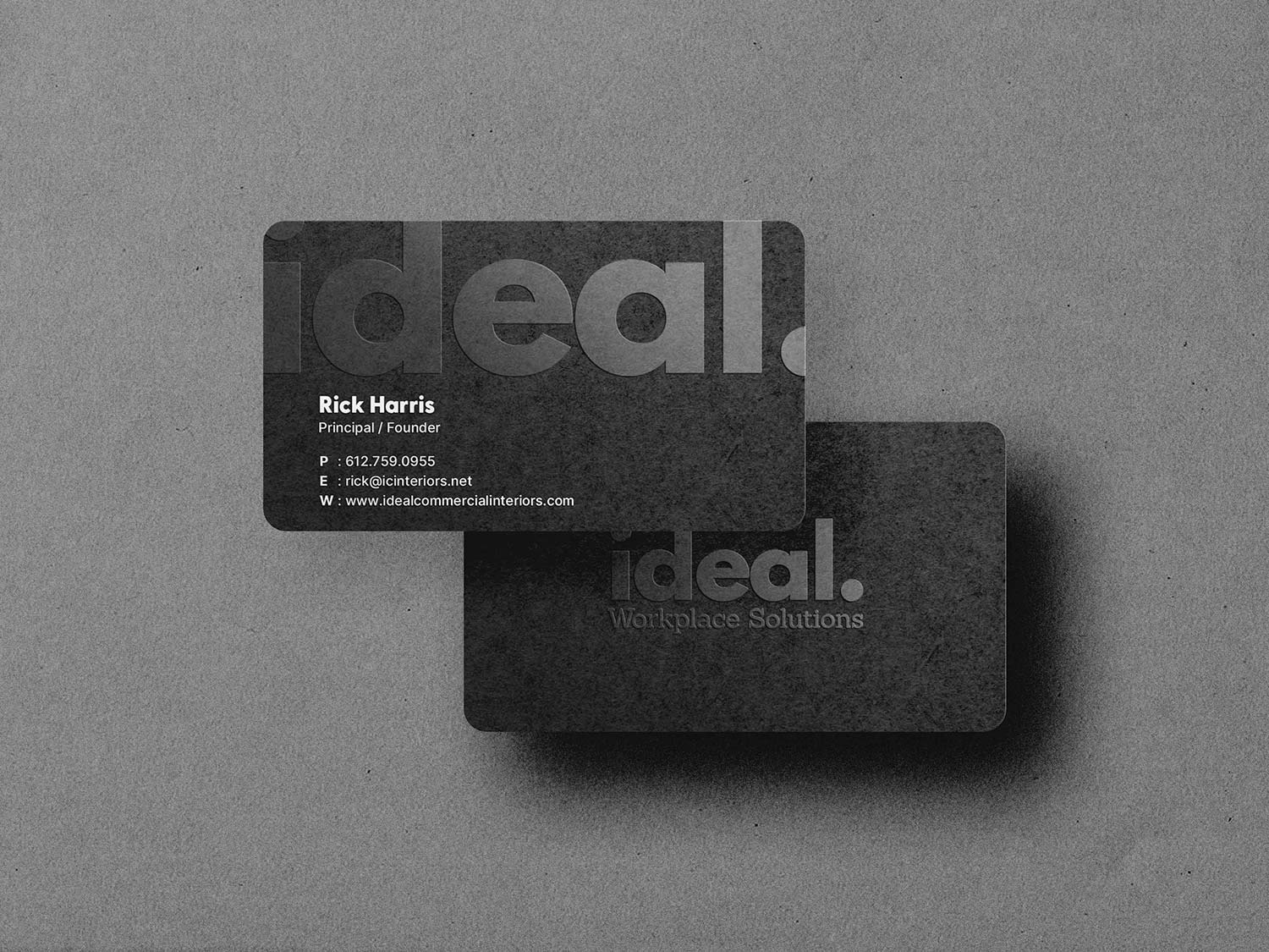
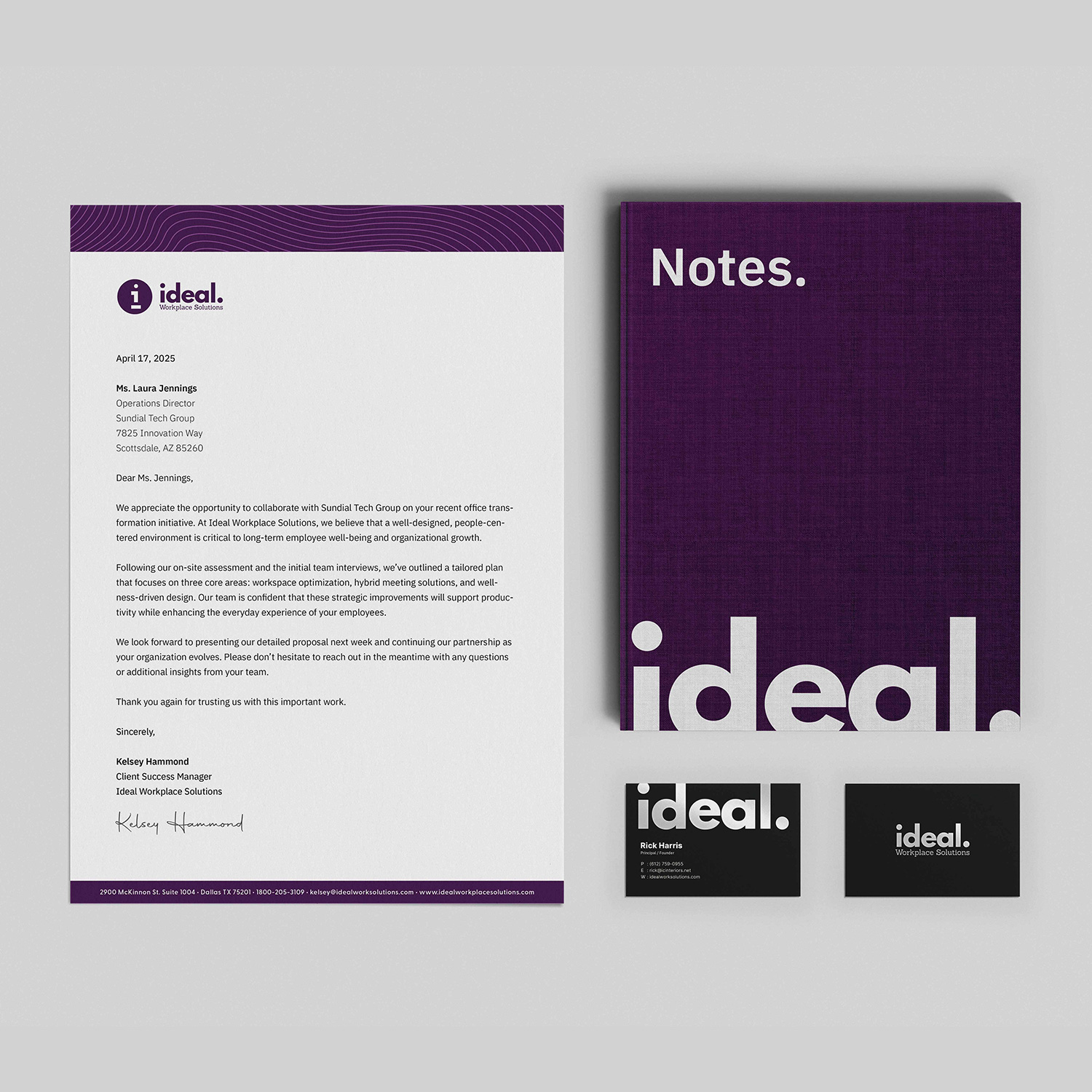
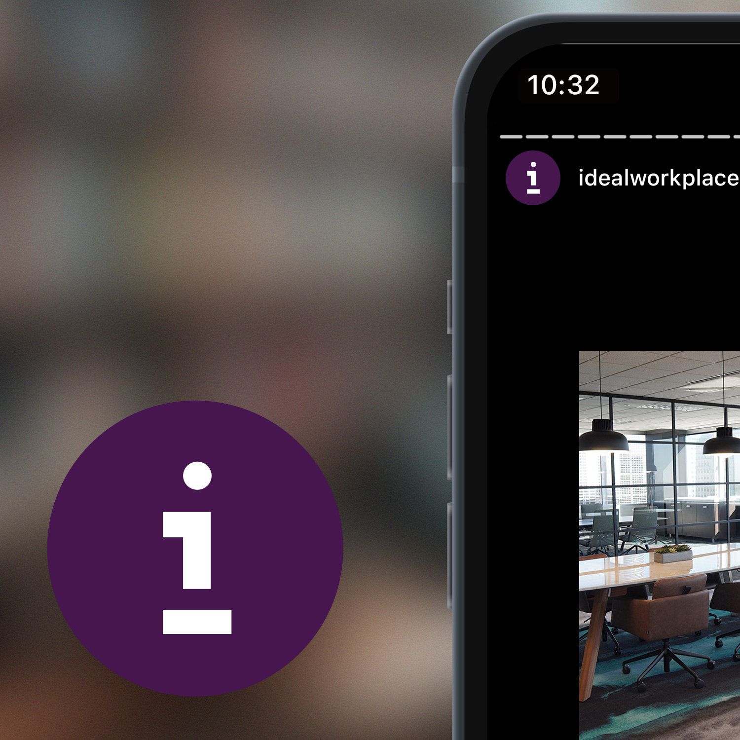
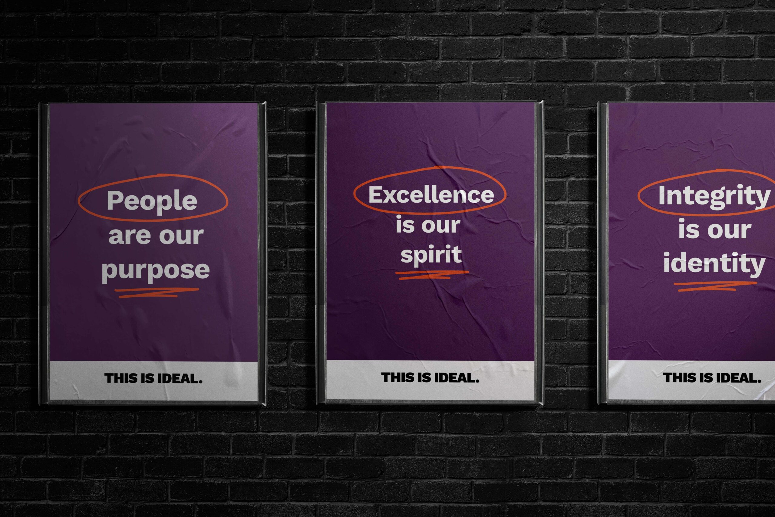
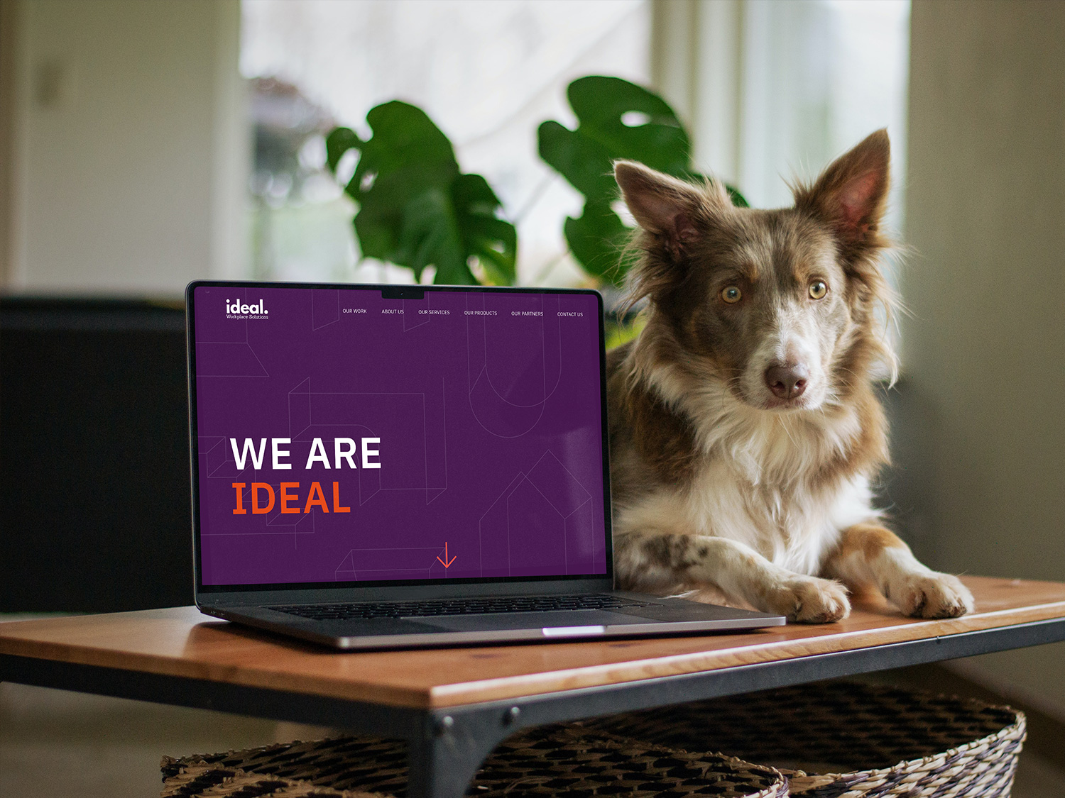
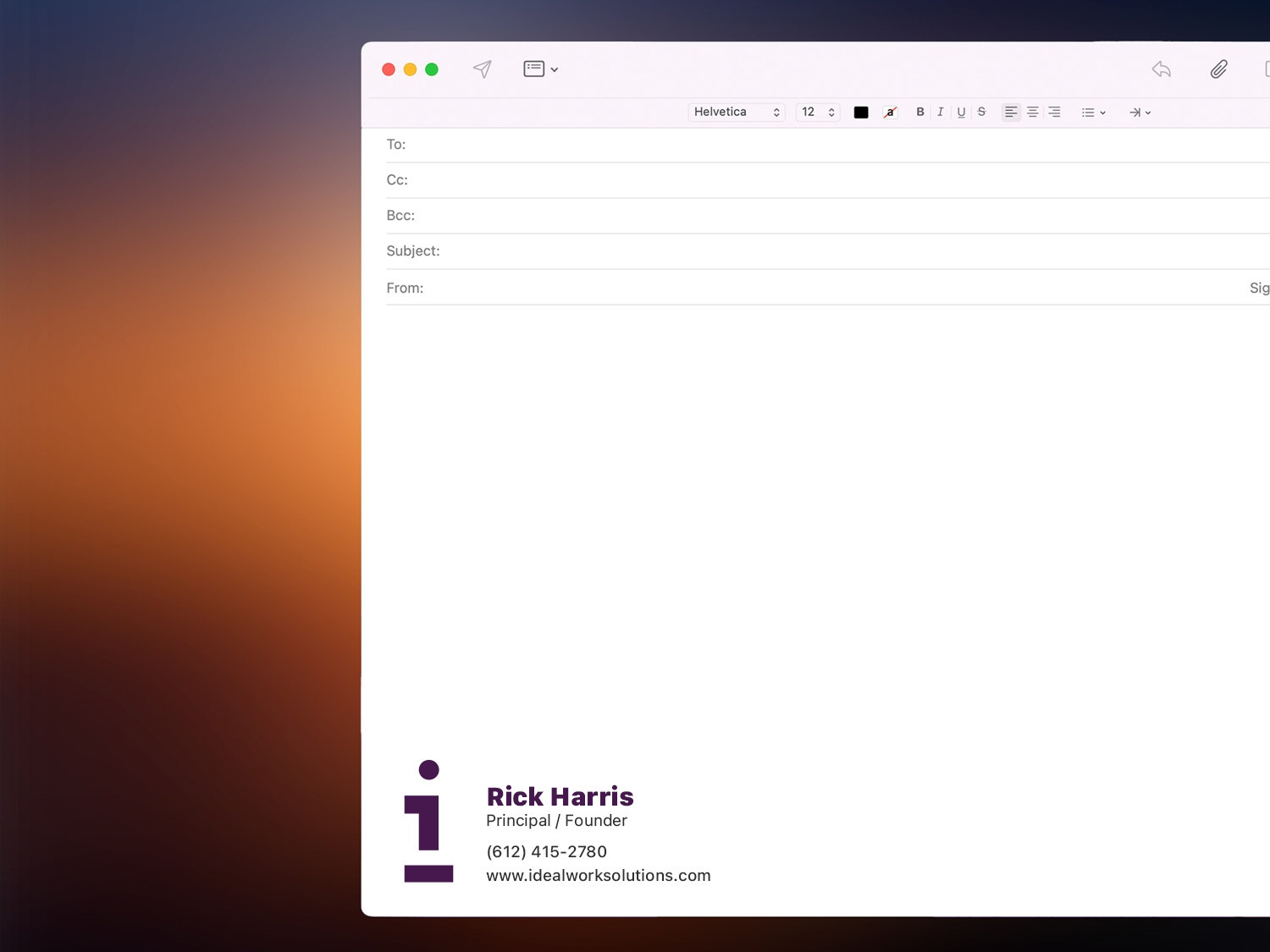
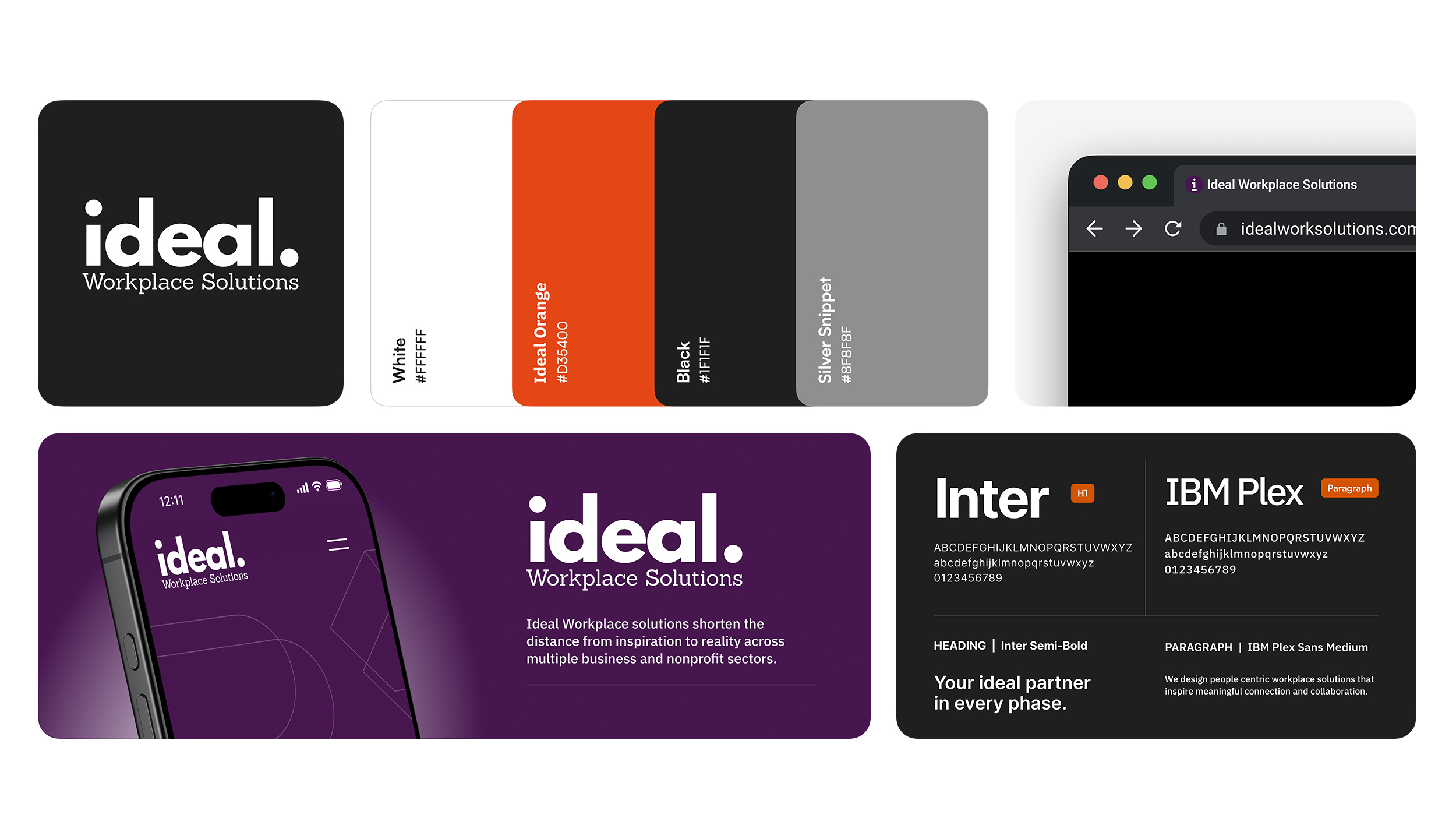
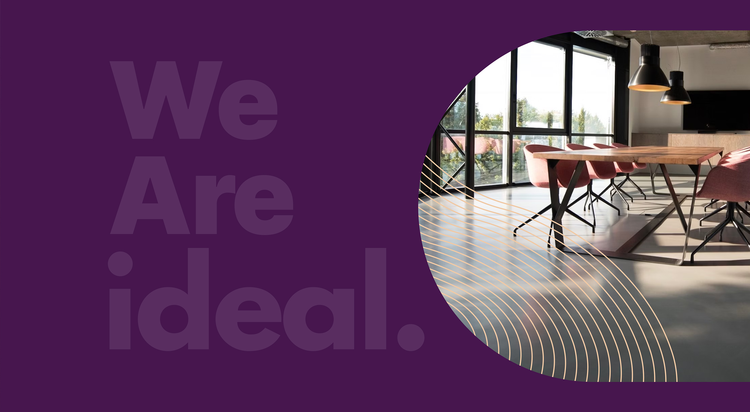
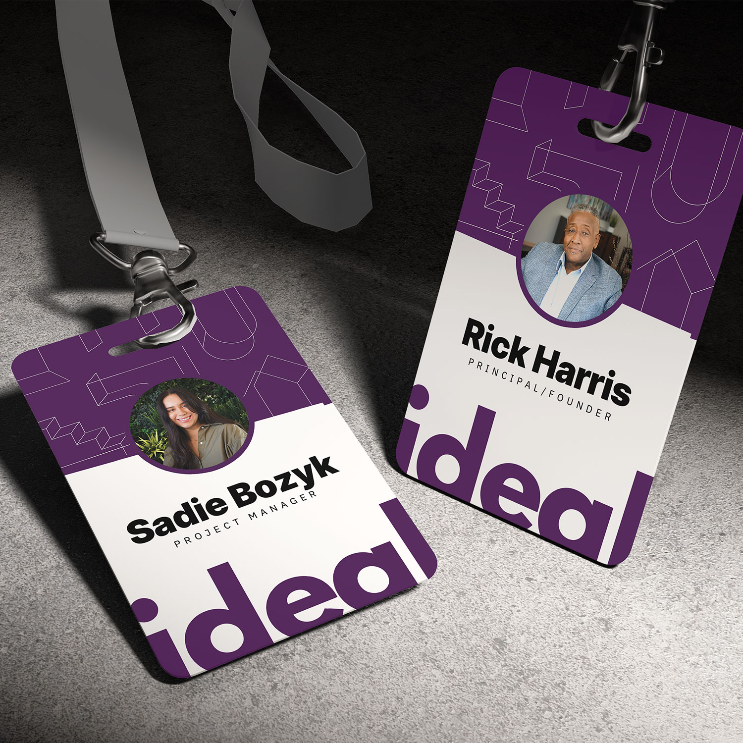
Ideal Workplace Solutions, a commercial interior design studio focused on people-centric spaces, partnered with me to refresh their brand as they transitioned to the simplified name “Ideal.” I redesigned their logo, introduced a vibrant new color palette, and developed updated marketing materials, all aimed at aligning their visual identity with their mission to be a full-service partner in creating workspaces that inspire connection and collaboration.
- BRAND STRATEGY
- BRAND IDENTITY
- LOGO DESIGN
- UX STRATEGY
- WEB DESIGN


The visual system was designed to feel clear, structured and intentional. Every detail—from the spacing between elements to the relationship between the brandmark and wordmark is carefully considered to create balance. The bold, geometric icon pairs with a classic serif typeface to reflect both precision and personality, echoing Ideal’s mission to turn thoughtful ideas into functional, people-first workspaces.
The clean, geometric icon paired with a grounded serif wordmark reflects both precision and warmth, mirroring the company’s role in transforming workplace concepts into functional, people-centered environments.
The visual system is based on playing with the axes of space, even in the layout of the pieces. This is not only a reference to Zeen’s three-dimensional work, but also a way of underlining the company’s approach to transforming concepts and designs into three-dimensional and realistic visual creations.
Add Your Heading Text Here

Lake Media Group
