Visual Identity / Branding / Web Design
Lake Media Group
A Symbol of Unity
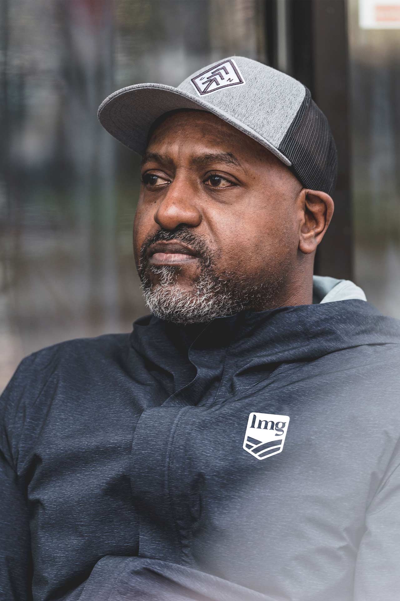
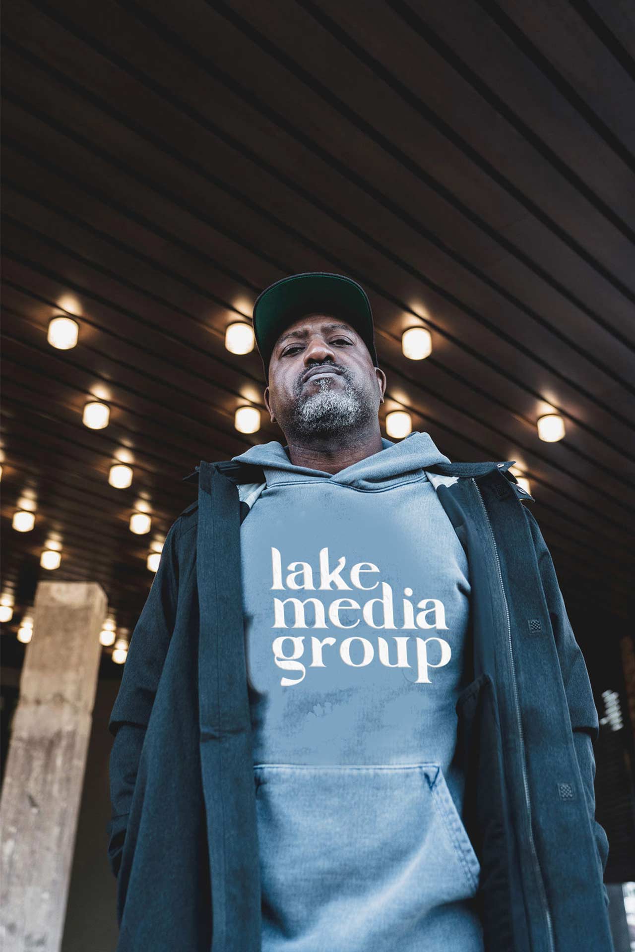
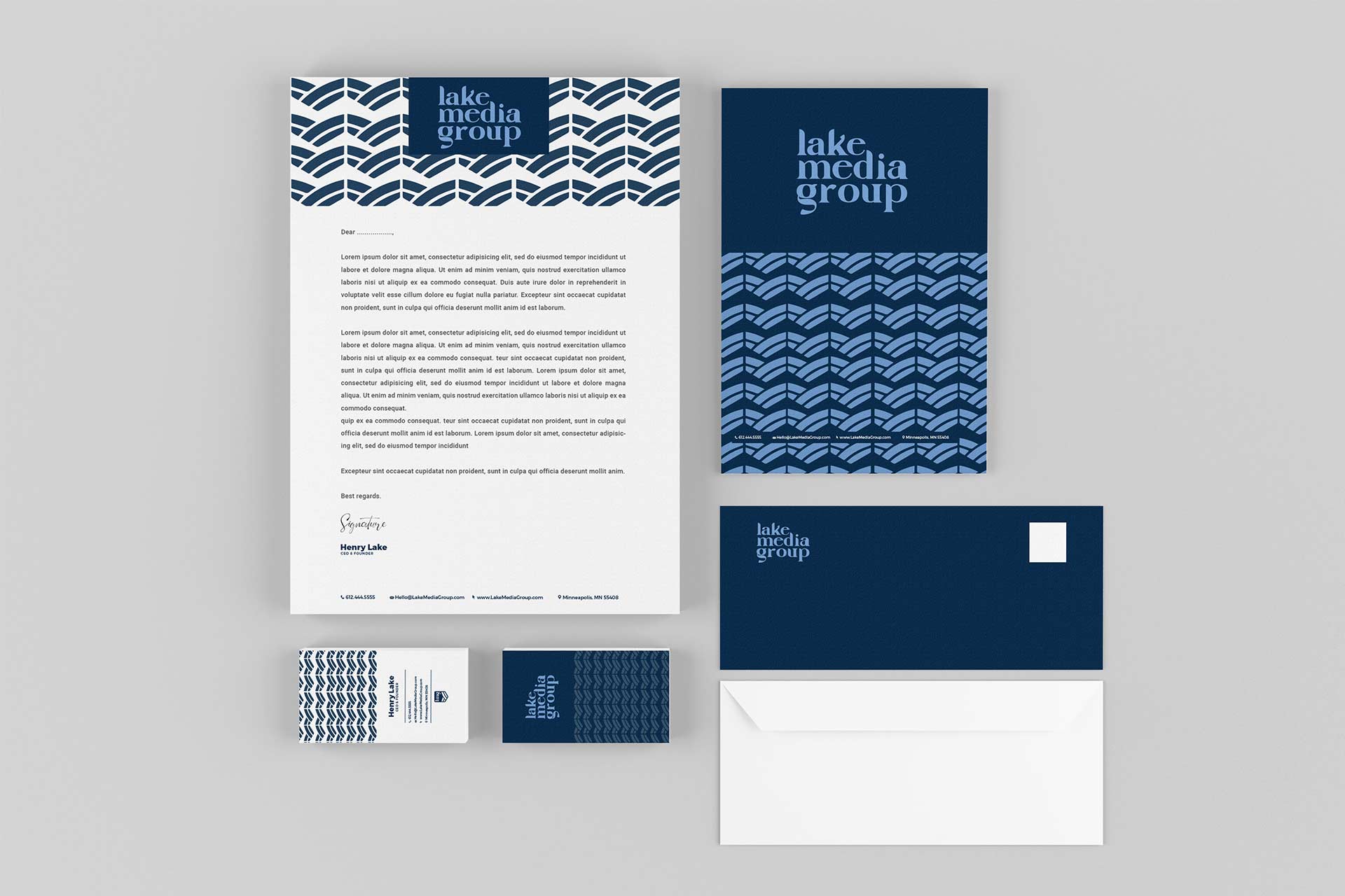
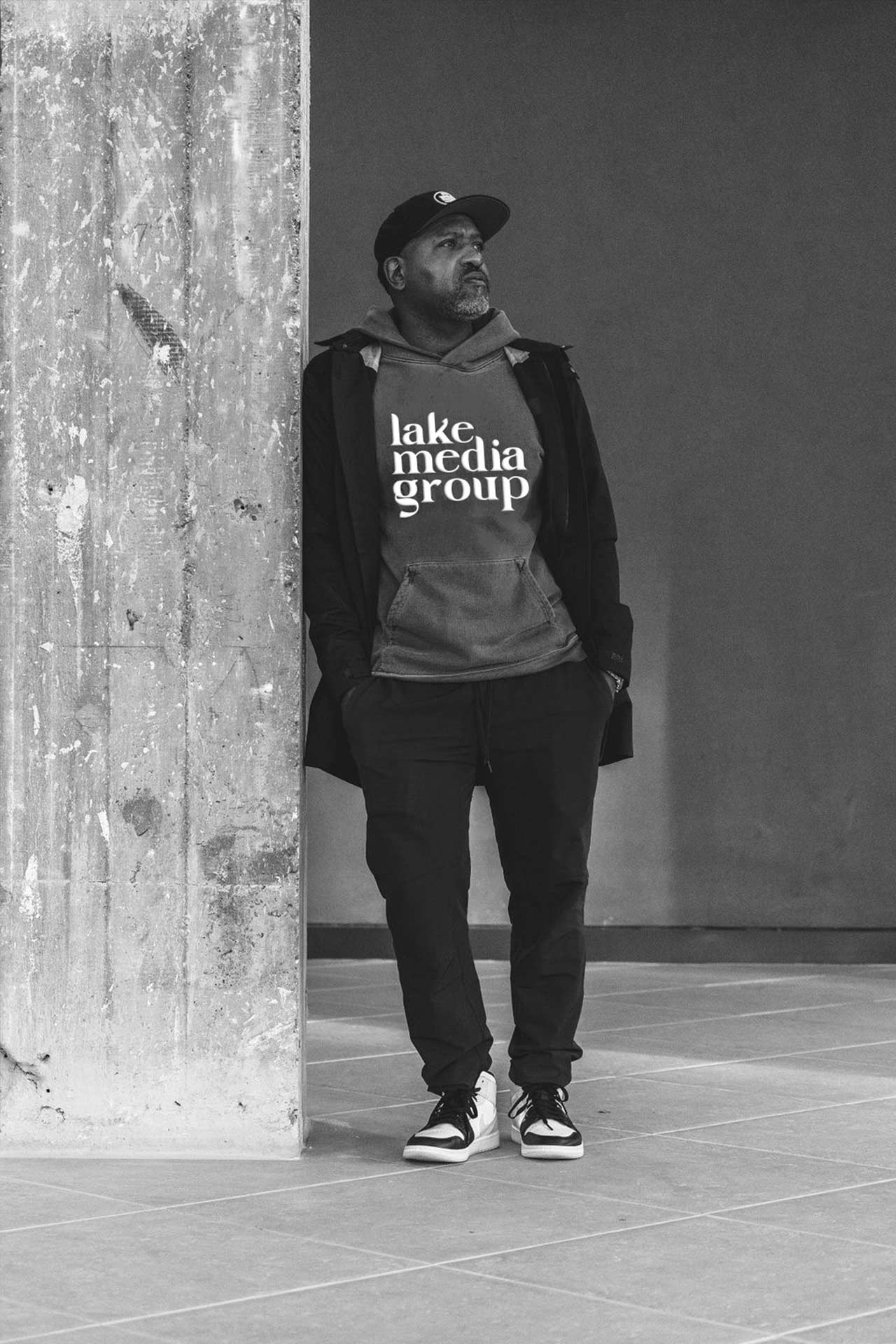
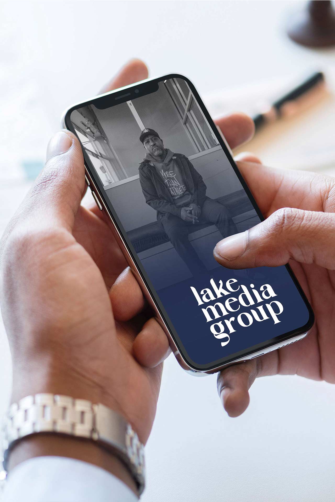
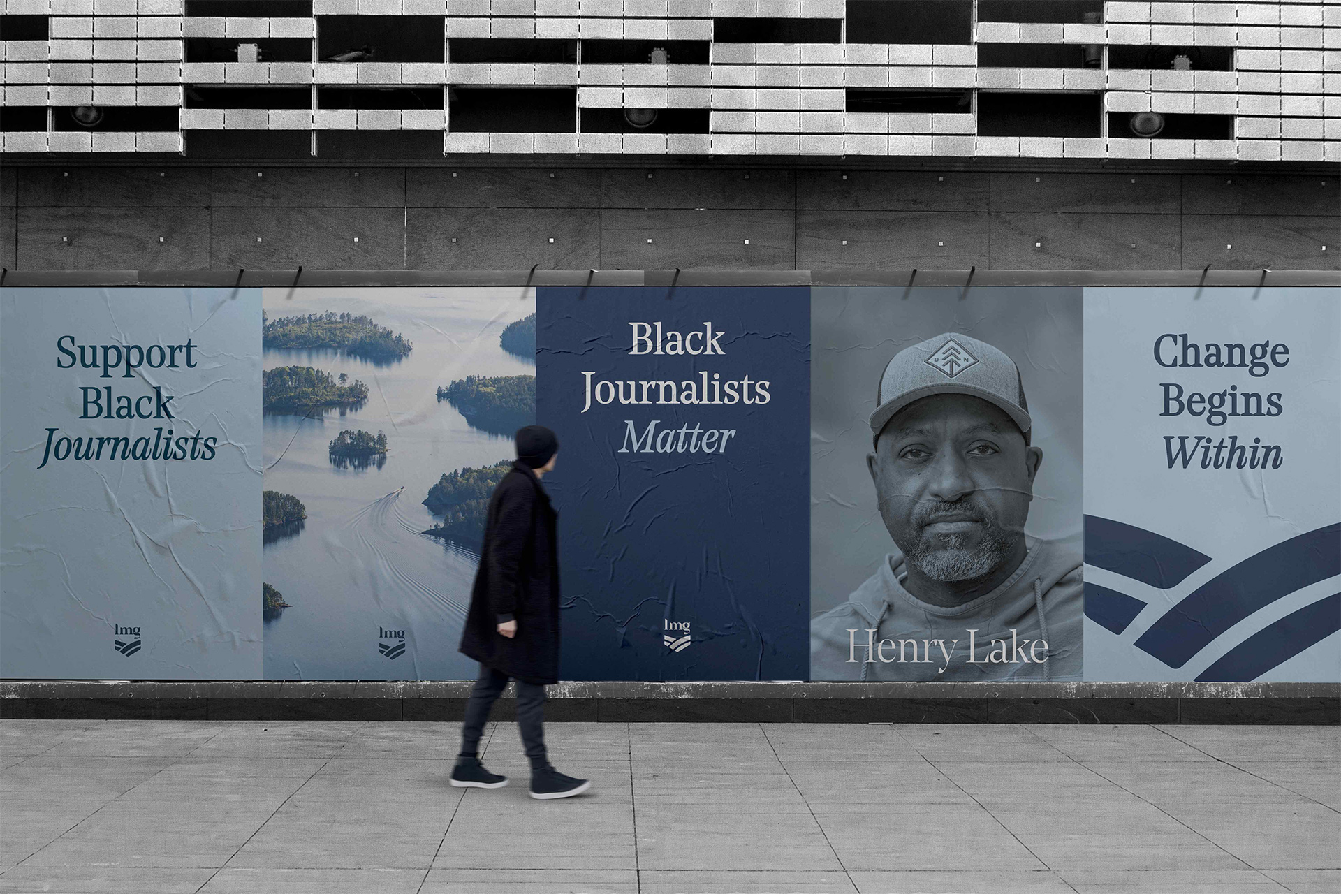
Lake Media Group's New Badge and Wordmark
The goal was to create a visual identity for Lake Media Group that embodies Black Excellence, sophistication, and professionalism. The brand needed to convey a sense of respectability and authority while appealing to a modern audience.
- BRAND STRATEGY
- BRAND FRAMEWORK
- BRAND VOICE
- BRAND IDENTITY
- WEB DESIGN
Bridging the Gap with a Bold Design System
I developed a shield with fluid, curved, bold symmetrical lines. This design symbolizes bridging the gap in the media and news market from a Black journalist’s perspective. It also represents the Twin Cities of Minneapolis and Saint Paul, divided by a bridge, highlighting the brand’s origin and its mission to unify diverse voices.
MARKETING ROLLOUT
A few words...
Travon listened to our feedback and found ways to incorporate it when it felt right… When it didn’t, he respectfully challenged us to get at the heart of the ‘why’ behind it. In short, Travon "got" us.
HENRY LAKE, FOUNDER + CEO
Next Project
The Silverroom
Keep Scrolling